Lingo
The enjoyable way to learn language.

The challenge
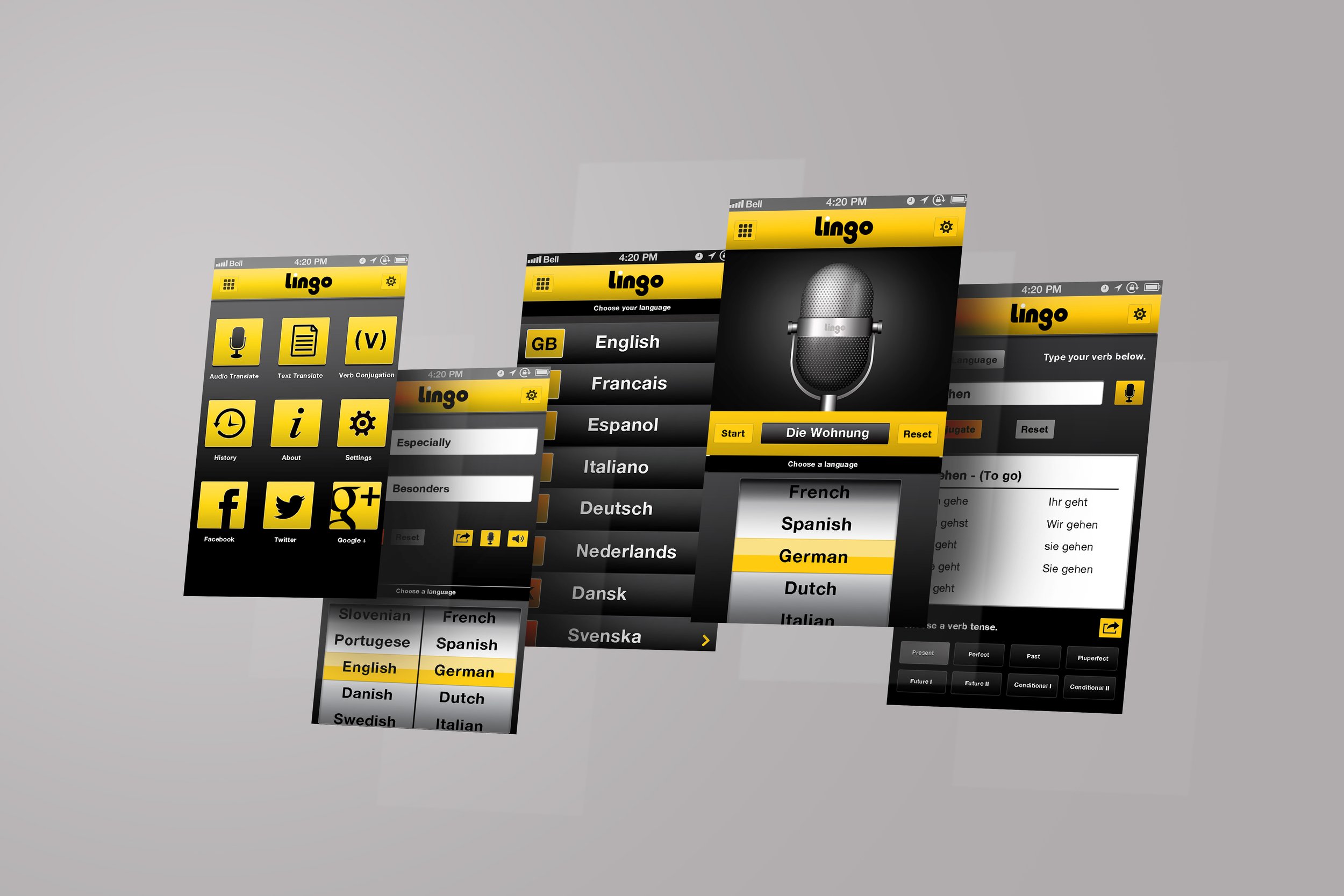
Lingo is an ambitious tech start up offering a more comprehensive approach to translation apps. For Lingo, learning a language should be a positive and rewarding experience so their user experience sought to deliver ver conjugation as well as translation to help learners advance quicker. With the tech in development, Lingo needed a brand identity and interface proof of concept to help them acquire investment.
Our approach
We worked with Lingo to better understand their aims as a brand along with the experience they planned to deliver to users. They were adamant that the brand and app should be a positive and uplifting experience for people and an antidote to the stress of language learning. This insight became the prime motivation for our creative process.
Our solution
We designed a brand identity and interface that was deliberately upbeat and approachable. The high contrast of yellow and white against black, positioned Lingo as the light at the end of the tunnel, motivating users and making language learning enjoyable.
The result
Both the brand identity and user interface gave Lingo the confidence to present their story to potential investors with a solid story and sense of purpose.


